WORKFOLIO * DESIGN RESEARCH
Can an Apple watchband embody time ?
A series of mood boards prompts designers to consider how we experience time across summer sports fields to inspire a new series of watchbands for Summer Olympics.
Apple revolutionized personal technology with the introduction of the Macintosh in 1984. The Apple Watch is a line of smartwatches incorporating fitness tracking and health-oriented capabilities. It was released on April 24, 2015, and quickly became its best-selling wearable device that quarter.
In November 2016, Apple’s Archive & Color team invited me to create a mood board to inspire the design of an imaginary set of watchbands for the Olympics.
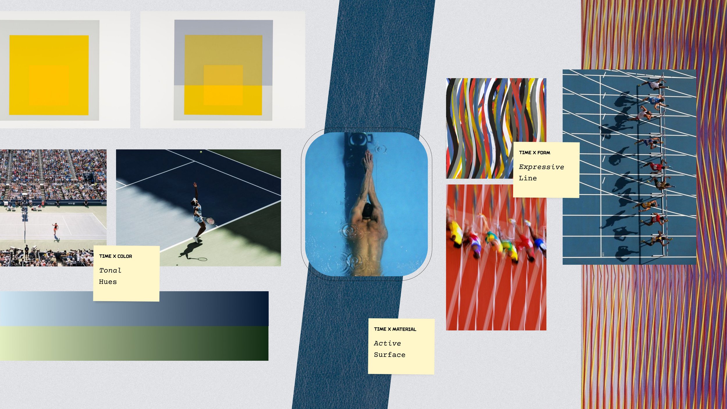
I focused on Summer Olympics, and generated a sequence of mood boards for designers to consider how we experience time on summer sports fields and how said experiences might translate to design elements like form, color, and materials. The resulting mood boards propose three main design principles: expressive lines, tonal hues, and active surfaces.
While this approach was not selected by Apple, a curious watchband did appear in May 2019 that may or may not have been directly inspired by this work.
Time x Motion: Expressive Lines
Selected imagery celebrates the universal language and storytelling potential of sports fields, in dialogue with abstract art in order to distill essential forms and their expressive qualities of motion over time.
Time x Color: Tonal Hues
Photographs by Thomas Prior at the US Open at various times of day alongside color studies by Joseph Albers prompt designers to consider a tonal approach to color that evokes the passage of time.
Time x Material: Active Surfaces
Worn on the wrist, watchbands are highly tactile and active pieces. Select material samples from Maharam alongside summer sports photography encourage designers to factor in material surface in terms of both performance and sensation.