WORKFOLIO * CONTENT DESIGN
Digital Primers for The Met Museum
My work at The Metropolitan Museum of Art includes visual direction and story design of Primers — immersive and interactive editorial on metmuseum.org profiling select exhibitions and collection areas.
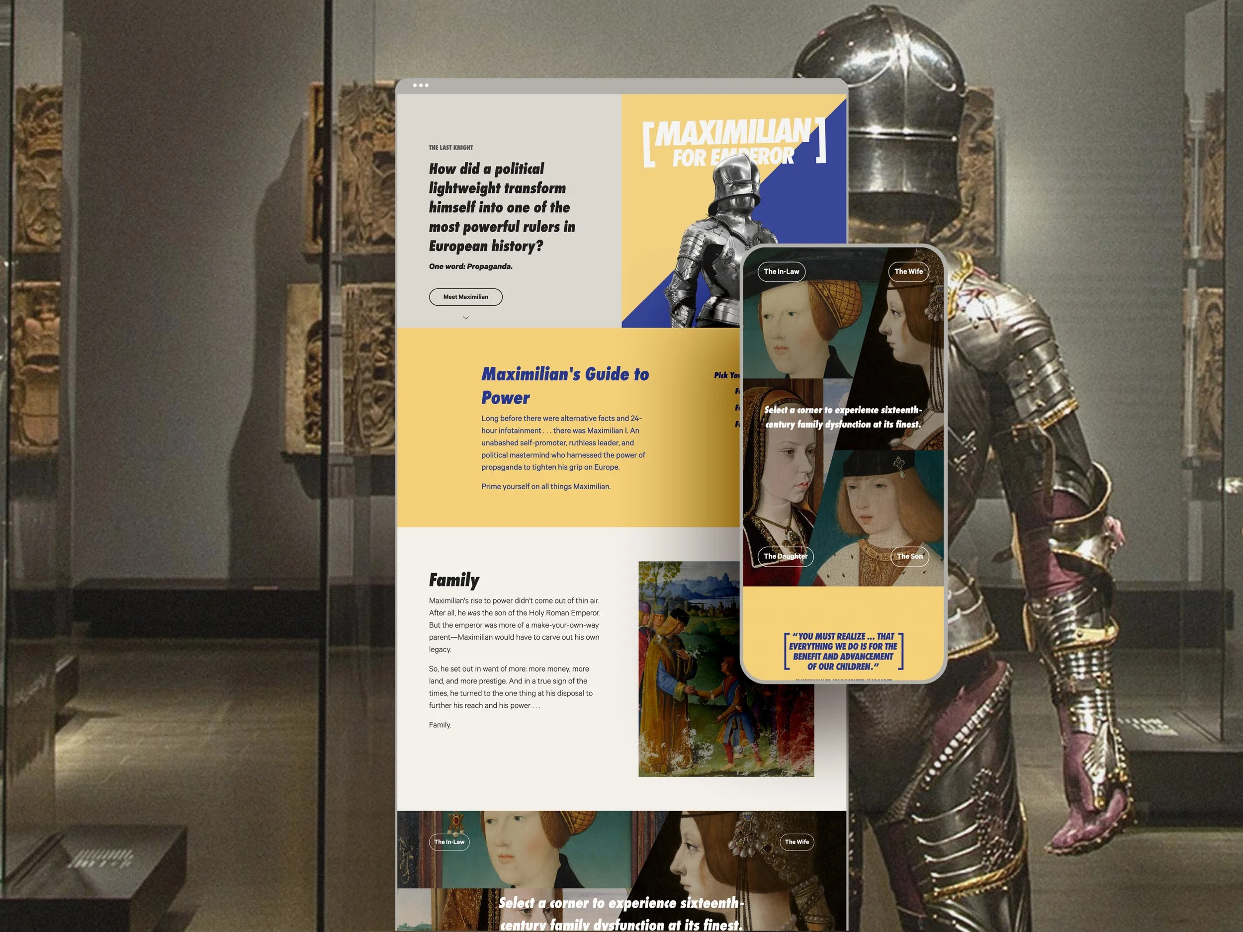
In Spring 2019, The Metropolitan Museum of Art launched a new digital product on metmuseum.org called Primers — mobile-friendly, multi-media editorials that aim to delight and inform visitors on a given exhibition or collection area.
Primers are designed with a system of customizable and stackable editorial components (poster texts, interstitials, image + text blocks, and interactive multi-media galleries) that can be arranged vertically into a scrollable narrative. These components present information in digestible bits inviting users to engage with a story on three levels: (1) skim, (2) swim, and (3) dive.
After collaborating on story design and visual direction on a few previous Primers including The Last Knight, Gerhard Richter, The Met Cloisters, and Making The Met, I led design for the exhibition Primer for The Medici: Portraits and Politics, 1512–1570.
Case Study: The Medici Portraits Primer
The Medici Portraits Primer tells the story of Cosimo I de’ Medici and his family’s strategic use of portraiture in Renaissance Italy through the lens of influencer culture today. The visual design takes direction from UI environments and language native to social media platforms.
Here are just a few favorite design elements that link this genre of Renaissance portraiture with digital design and representation today.
Framing Devices
An artwork’s frame can bridge the world of the art with its setting. That said, we used Proxima Soft, a simple, rounded typeface (with an internet origin story!), and phone- and app-inspired graphic masking treatments to take a 21st-century view of 16th-century portraiture.
Dark + Light Modes
Dark and light mode palettes using tonal grays, shadows, and gradients create understated yet enveloping browsing environments that describe UX color principles while evoking pietra serena, a gray sandstone used in Renaissance Florentine architecture.
Evocative UI
Recognizable UI colors add a subtle jewel-tone embellishment of subtext to interactive story components. For example, green “flip” buttons used in an interactive portrait gallery evoke active status symbols common on social avatars. Red buttons in our chapter on Cosimo’s legacy are a nod to Pinterest.
Responsive Color
In addition to a foundational palette of dark and light elevations and jewel-tone UI accents, the experience includes several gradient backgrounds that respond to colors in featured artworks. The gradients are strategically placed in prominent sections like the three chapter-heads imaged above. These gradients recall the modern sense of backdrop and lighting in Renaissance paintings, the in-gallery spotlighting experience, as well as the automated background gradients common in image editors on platforms like Instagram.
Form Meets Narrative
Graphic treatments and formatting take inspiration from social media settings to style specific storylines. For example, a deep dive essay on a single engraving takes the form of a Twitter thread outlining the artwork’s symbolistic shorthand in quick takes while an interactive section about visionary legacy takes inspiration from Pinterest boards.


